Pastisseria Valls SL is a cake shop in a small city who needs to gain visibility. To achieve that, a global design project was planned.
Firstly, a new branding design was created by a professional graphic designer. You can see the new brand -> here.
Based on that new design, the following seps were developed one by one:
Corporate site
Site basic data:
- Main domain: calestaronges.com
- Redirected domain: pastisseriavalls.com
- Techniques applied: User Centered Design, Prototyping
- Content Management System: WordPress
Prototyping - Wireframe


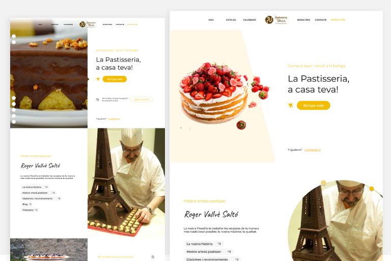
The first step is to create a basic structure. wireframe made with Figma.
Prototyping - Mockups


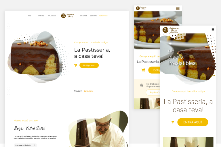
Based on the previous Wireframe, some mockup ideas came to my mind. I needed the design to be dynamic, fluid and modern-alike. All designs were done in Figma. The third design was the chosen one!
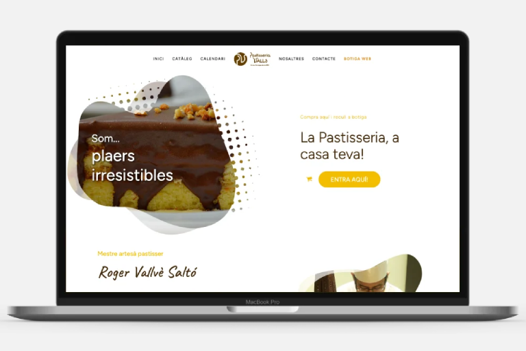
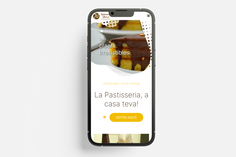
The chosen design
Both new and recurrent users will land into a clean & appealling site. The aim is to reflect the feeling of “tasty” from the client products (bakery and pastry, in that case) on the site.


To achieve that, typographies must be smooth and easy to read, images must be organic-shaped and color palette must be based on colors that can be easily found in a cake: chocolate-browns and cream-yellows.
User Interface Design - UI Kit
Fonts, typographies, color palette, spacings, etc. have been taken into account to create a proper website atmosphere. We summarize all them in a UI Kit.
Color palette
Fonts
Regular texts and headings
Caveat font
Highlighted headings
Typographies
Heading 1
Heading 2
Heading 3
Heading highlighted
Big pararaph
Paragraph
Small paragraph
Icons
Components

