Eduard Vallvé
Creative web & multimedia designer
The challenge
Some time ago I had the opportunity to create the website of Pastisseria Valls SL (A cake shop in Valls, Tarragona, Spain. Click for more info.) and to visually unify it with their online store created with BigCartel.
Not all the ideas raised in the design process were implemented in the final product. One of them would have added a new commercial utility to the web: To send personalized orders to the company, so you can order products off the menu.
Despite not having implemented this feature, the company has stated in the past that out-of-letter orders are the most rewarding and attractive ones, for both the customer and the company.
For that reason, I took the challenge to develop a redesign of the web cover that maintains the current goals and includes the new functionality called “Et prenem nota”.
Scope of work
Requirements
Keep all existing functionalities and create a renewed corporate design.
Create a new space where users can make their out-of-letter orders with rewarding User Experience.
User Journey
This process describes the steps that the user takes to complete the main task of the new functionality.
User Persona: Mary
Scenario:
Mary has a 7-year-old nephew who will turn 8 next month. Mary wants to surprise him and decides to bring her nephew his favorite cake on his birthday.
Task:
Order a custom, out-of-letter cake using the new functionality.

Information Architecture
The new functionality called “Et prenem nota” should be a new pillar of the website. So it’s a good idea to include it in the main navigation menu. These are the old and the new nav menu.
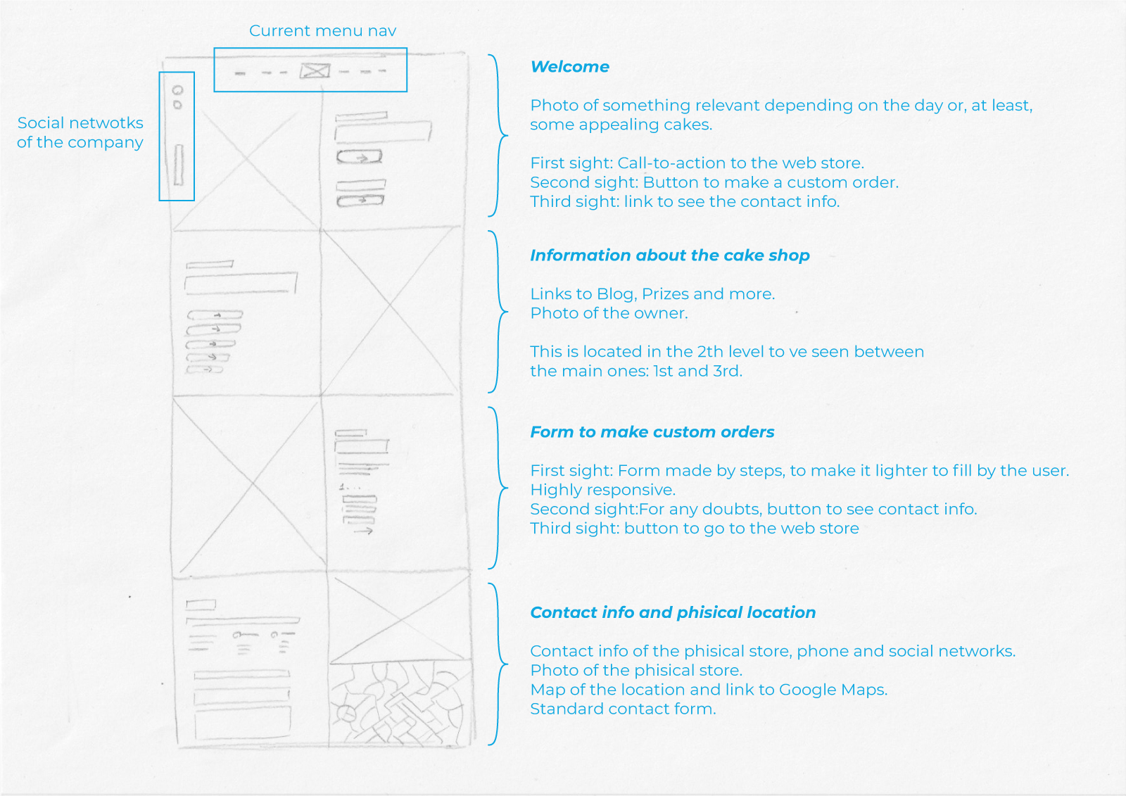
Sketching


User flow
Wireframes

Design System
Based on the wireframes and the results of user testing, I determined the basic design elements and began to create a flexible pattern library.
Color palette

Typography
Montserrat
Google Font. Used for text and titles.
Caveat Bold
Google Font. Used for humanized emphasis.
Motion and animations
Small animations can tell the difference between a positive and a negative user experience.

Multiscroll

Final design


Responsiveness
